


UX/UI Designer
3 Months
Adobe Xd
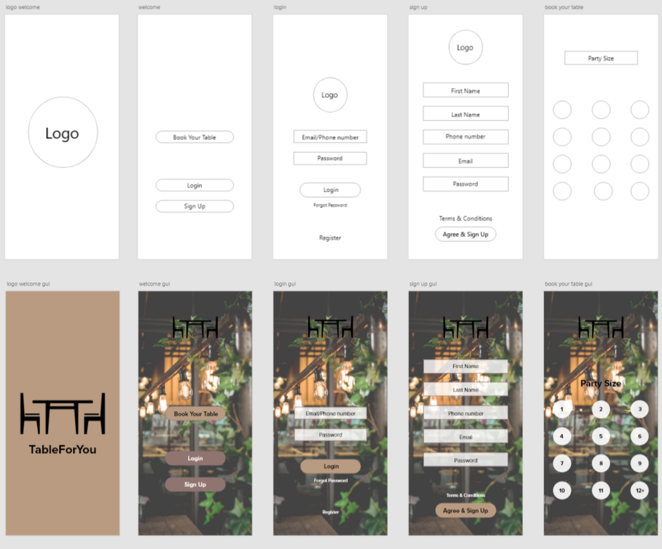
TableForYou is a restaurant reservation app that also allows users to choose the table they would like to at.
The idea for this application is to make booking a table at a restaurant easier for the consumer. Rather than waiting on the phone to book a table, the user will be able to do it with ease through the application. The main focus of this application is for the user not only to book their reservation but also to book the table that they would like to be seated at.

Richard is a manager in a large company and doesn’t have a lot of time to eat out, but will make space for special occasions to dine out, which would then need to be made in advance. He is an introvert and impatient with a fast-paced mindset.

Emily is a foodie and likes to dine out with her friends once a month. She has a nomadic lifestyle and lives her life through her phone. She is an extrovert who loves a good chit-chat but likes to get things done efficiently.

WalkUp takes queuing in reality virtually. It takes your geo-location to find restaurants near you that are partnered with WalkUp to book a place in line at restaurants near you and show how long the waiting time is or if there is any space left in the queue. When you have booked your place in the queue, the application will show your number in place and the approximate waiting time that you may have left before you are seated. When a table is ready, the user will receive a notification on their phone and will have 10 minutes to get to the restaurant before the table is given away.
When speaking to my target audience, they mentioned that they liked the ease of booking your place in the queue; however, to book the geo-location needs to be turned on for it to work. Additionally, there was no category to specifically choose the type of food they would like to eat. As well as this, it is not clear on the map the type of restaurants that are around them.
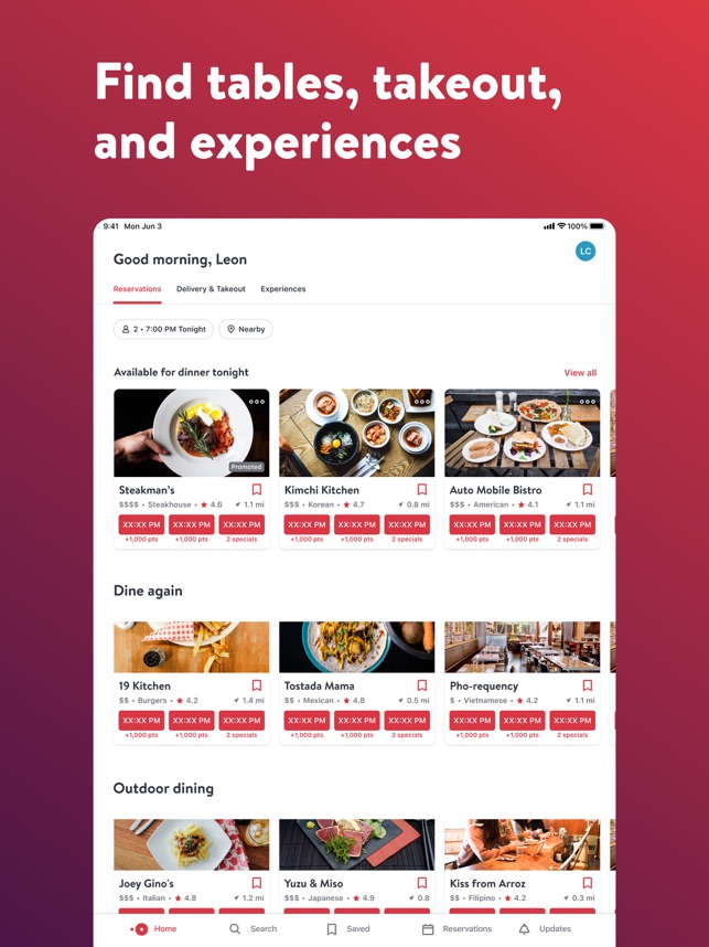
OpenTable is a third-party app that allows user to make reservations for particular restaurants. You are able to book and manage reservations made through your phone. The app allows you to search for different cuisines you are interested in and shows you a list of restaurants available to book when putting in the date, time, and the number of people dining out to make choosing and booking easier.
The OpenTable app takes the users on a journey on their home page as it shows what restaurants nearby are available to book now and the time you can book for. This does not only give the options for the categories for cuisines but also different categories for the experience and the best spots to eat at. One thing I did not like about the application was that the user needs to have their geo-location on in order to use the app.
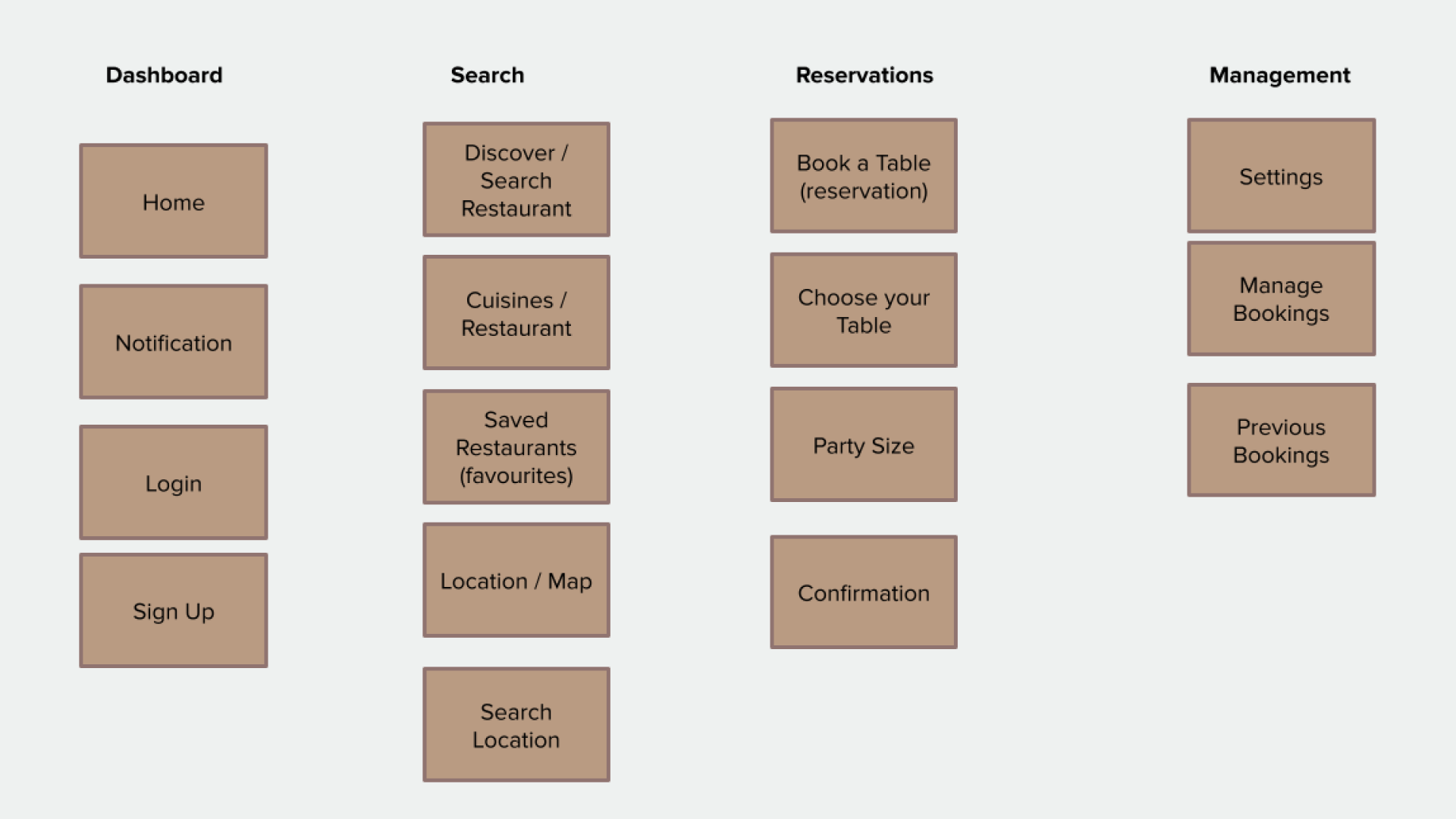
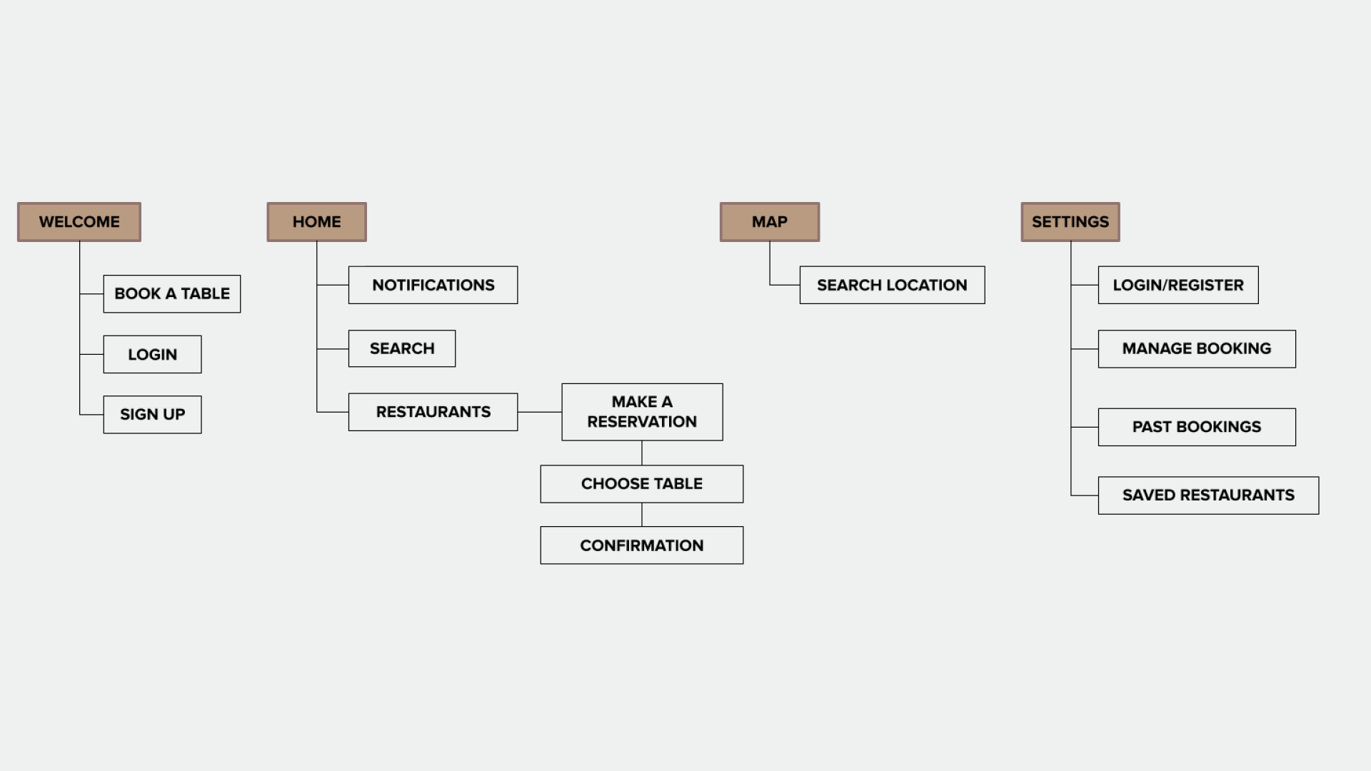
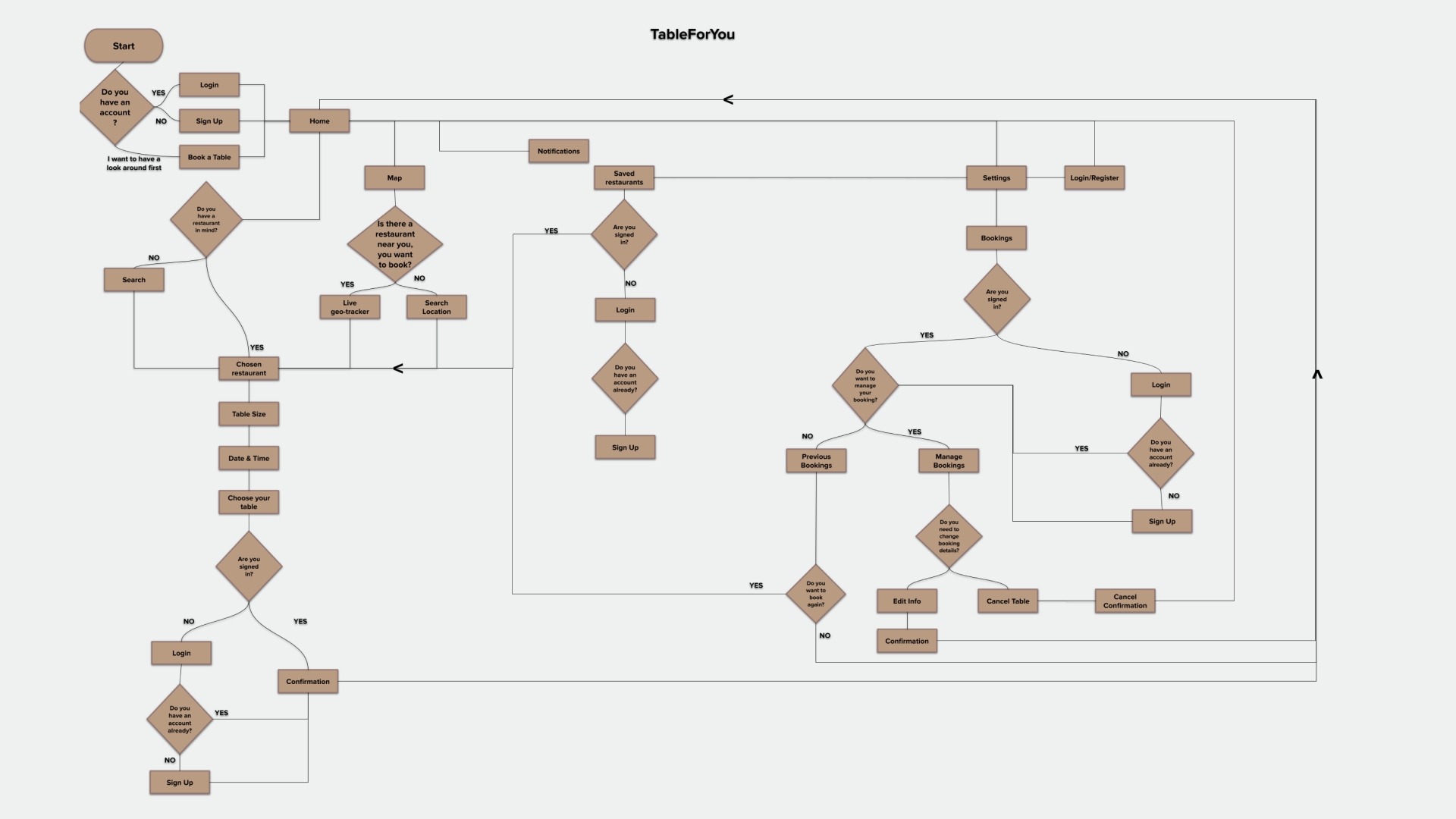
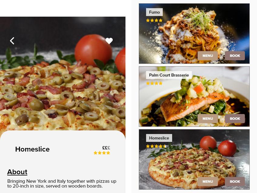
After collecting the feedback from my user testing I made some small changes to the discover page by adding the option for the users to view the menu before they book but also keeping the booking button if the users wants a quicker process in booking their table.
Some users mentioned to add some stars or the pricing of the restaurant. For this, I chose that on the discover page it would show the ratings only, as they have the option to see the menu. I also added the pricing symbol for how expensive or cheap the restaurant was in the menu and the booking page so that it could be a quick overview of how much they might be spending.
While designing the TableForYou app, I learned that there is a lot of iteration that will occur throughout the process. Usability studies and peer feedback help the iteration process of each screen design.